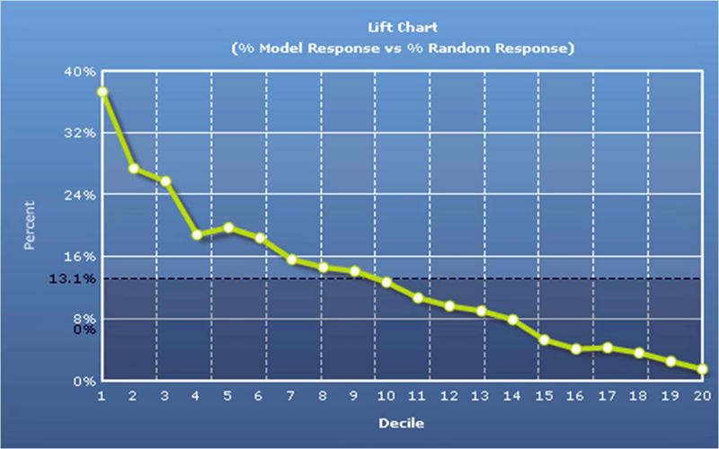
Lift Charts

Lift charts demonstrate the predicted effectiveness of modeling. The “flat” or random line (dark-dashed line) indicates the expected penetration of business-as-usual. The steep (green) line indicates expected penetration from using the ranked list (from the model). In the example below, prospects in the first demi-decile (top 5%) are expected to respond about 3.5 times as frequently as a “random” customer. By utilizing the ranked list, fewer pieces can be mailed (to achieve a certain number of new customers) or more new customers can be found (for a given budget). Conversely, you can learn who your worst prospects are, allowing you to stop expending marketing resources on them.

Click here to see a sample Lift Chart Report

CONTACT US

    Are You a List Broker ?


    • Get full access to online tools
    • IT support from professional data managers
    • Private Label our tools
    • high-demand revenue stream
    • Just fill out the form below.

    DISCOVER YOUR PERFECT CUSTOMER DATA LIST

    We will work with you to build a data list of qualified lead prospects to target across channels in your upcoming marketing campaign.